The observation below is a good commentary on contemporary practice among many (perhaps most) design professionals today.
“… I am always surprised at how much architects and engineers discount the amount of time wasted in unique documentation of repetitive design elements.” - John W. Gill, PE, PMP
Drawing Systems are intended to simplify and streamline aspects of the CD documentation effort. Generally, they are not "perfect" systems in the sense they purposely do not try to cover every kind of situation found – just the majority of them. Unusual, atypical and special situations may warrant additional drawings or notes.
The Toilet Types sheet discussed below is one such system.
Note that while the use of Drawing Systems is a "big idea", the systematic approach used and the need to think about what one is doing gets quite granular in places. The benefit provided is that of allowing for rapid documentation with great accuracy. However, implementation of systems such as these without understanding how it works and is applied will result in errors. It must be reviewed and adapted to each project.
The Sheet
This sheet below is pre-assembled in Revit and opening it displays all components grouped together. They are described in detail below.
The Toilet Types sheet with instructional text to the modeler / drafter in blue
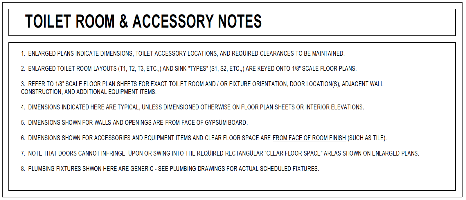
Toilet Room & Accessory Notes
Essential rules for use of the sheet and how it relates to other drawings; it is instructional to the drafter / modeler and the contractor.
Toilet Accessories Schedule
A pre-selected list of all Toilet Accessories to be used on the project. Edit to revise, adding or deleting items for your project. Checking recently, about 50% of the original selections made in 1996 are still in use on the latest iteration of this sheet! Some have been changed over the preceding 21 years to what is considered a better base standard, a very few have been discontinued. There is a real benefit here as research performed in 1996 continues to be leveraged across projects today.
Numbering categories do not change - TA7 will always be grab bars. The A, B, or C suffix can revise as needed. Advantage - work on one project and everyone knows what a TA7 is…
Mounting Heights – Fixtures & Accessories
Accessible & non-accessible components are elevated here w/ vertical mounting height criteria.
Dimensions for the fixtures and accessories are shown here only and should not be repeated elsewhere on any other drawings, such as interior elevations, where these components may be shown for context. Again, this is the only place in the set of construction documents where this criteria is found.
Example: It is common when elevating bathroom walls that have complex tile patterns to also show the toilet accessories that are on the walls for context. Re-dimensioning mounting height criteria there may inadvertently create introduce errors or conflicts w/ the information shown on this sheet. It is wasted effort to repeat work as we are creating unnecessary instances of repeating information that each need to be reviewed and coordinated with one another.
T1 Accessible Toilet Room
This drawing below is of a generic single occupant toilet room. It is instructional to the contractor with bubbled notes that explain how the tagging works. It also serves as a template for all single occupant, accessible toilet rooms.
Make sure the project toilet rooms are sized correctly on plans.
Include additional enlarged toilet room layouts from your project on this sheet. Label them - T2, T3, etc., and tag them appropriately using the other vignette drawings shown o this sheet.
Vignette drawings of toilet fixtures w/ accessories
Individual graphics for each type of water closet, urinal, toilets stalls, showers and sinks are provided with both accessible and non-accessible versions. They are intuitively labeled as WC1, WC2, SH1, S1, U1, etc., and are “pluggable” into other drawings.
ADA research performed in 1996 remains largely applicable today as well. Some revisions were made when ANSI became part of the mix due to adoption of the IBC and ADA was updated around 2010. Again, research conducted once is leveraged across many years and projects with periodic reviews and updates only.
OBSERVATIONS
Systems like the Toilet Types sheet described here work well for projects and embody several key themes that enable us to work smarter.
- Typical-ity – make things typical where you can and leverage that across documents
- Instructional – documents that coach the user on how to interpret them
- Default Scheduling – everything is this, U.N.O. (Your job is to find the exceptions and carefully and clearly document them)
- Default Referencing – as you draw & model, those elements are automatically scheduled and referenced
- Visual QA – mistakes “jump off the page” - or at least become more obvious
- Working in Context – group together related drawings and like information
As a follow-up to complete the review of this system, I will post the associated workflow in a few days.


